Chernoff FFFFUUUUUU (posted 08 Sep 2010)
I just recently bought and read through (most of) Tufte’s first book on graphs, and I read about something called Chernoff faces. From Wikipedia:
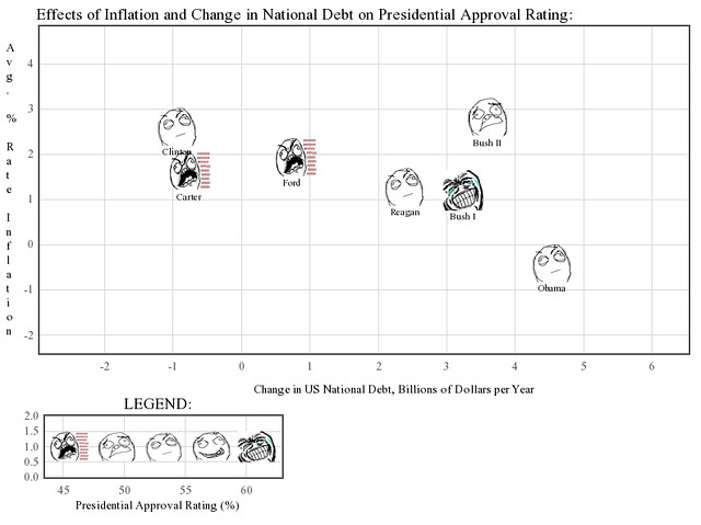
Chernoff faces display multivariate data in the shape of a human face. The individual parts, such as eyes, ears, mouth and nose represent values of the variables by their shape, size, placement and orientation.
While Wikipedia’s example shows just faces, in Tufte’s example (and I believe in other cases as well), these faces are actually used as markers on x-y plots, with the other n-2 dimensions represented by the faces. Interesting, right?
Then, I immediately thought of, well, my favorite meme.
…
>:D
 (
(I don’t feel like gh-pages-ifying the source, but it’s in its own repo here for your source-reading pleasure! I used flot for plotting, and underscore.js for some data-wrangling. That’s one thing the stock tools aren’t good for with javascript. :/
Some observations:
-
First, while “rage” of a rageface can be used to represent a variable pretty plainly, the other emotions are, in my opinion, too subtle to make much use of (I tried!). As such, while real Chernoff faces can represent many variables, you can only really get one out of chernoff FFFFUUUU-ces.
-
The ability to use arbitrary images isn’t something that’s baked into most plotting libraries. I originally looked into doing this with matplotlib, but the way to do so definitely wasn’t obvious. (*) Flot, which I ended up using, gives you the tools, but they’re more general than, “use this as a marker.” g.raphael, of course, still has a long way to go.
-
I don’t actually like flot that much. I mean, it works, but some of its api is a bit awkward. Text labels could’ve been done better, for example. Also, while the plots look okay, they don’t really appeal to my own sense of aesthetics. I think g.raphael, once it’s done and somewhat well-documented, will be more my speed.
-
I expected this plot to be complete and utter chartjunk, and while I wouldn’t recommend using this seriously, it’s actually surprisingly readable. I mean, you can actually draw conclusions from it. For instance, people disliked Carter and Ford way more than they disliked Bush II, on average. In addition, Clinton received more of a “meh” reaction from people than Carter, despite similar reductions in debt and inflation rates. Clearly, my x and y variables only paint part of the picture, if any.
(*) I emailed their listserv about my problem, and this was the one response I got:
Images can placed at arbitrary position (using the extent keyword). I think this is enough as far as you’re careful with the aspect. Looking at the wikipedia example, I don’t see any reason that this cannot be done with matplotlib.
Am I the only one that got a bit confused by this? :S